
1. Before you begin
Material Design is a design system built and supported by Google designers and developers to build high-quality digital experiences for Android, as well as other mobile and web platforms. It provides guidelines on how to build your app UI in a readable, attractive, and consistent manner.
In this codelab, you learn about Material Theming, which allows you to use Material Design in your app, with guidance on customizing colors, typography, and shapes. You can customize as little, or as much, as you like for your app. You also learn how to add a top app bar to display the app's name and icon.
Prerequisites
- Familiar with the Kotlin language, including syntax, functions, and variables.
- Able to build layouts in Compose, including rows and columns with padding.
- Able to create simple lists in Compose.
What you'll learn
- How to apply Material Theming to a Compose app.
- How to add a custom color palette to your app.
- How to add custom fonts to your app.
- How to add custom shapes to elements in your app.
- How to add a top app bar to your app.
What you'll build
- You will build a beautiful app that incorporates Material Design best practices.
What you'll need
- The latest version of Android Studio.
- An internet connection to download the starter code and fonts.
2. App overview
In this codelab, you create Woof, an app that displays a list of dogs and uses Material Design to create a beautiful app experience.

Through this codelab, we will show you some of what is possible using Material Theming. Use this codelab for ideas of how to use Material Theming to improve the look and feel of the apps you create in the future.
Color palette
Below are the color palettes for both light and dark themes that we will create.


Here is the final app in both light theme and dark theme.
Light theme | Dark theme |
|
|

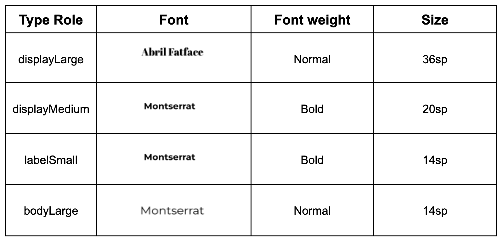
Typography
Below are the type styles you will use in the app.
Theme file
The Theme.kt file is the file that holds all the information about the theme of the app, which is defined through color, typography, and shape. This is an important file for you to know. Inside of the file is the composable WoofTheme(), which sets the colors, typography, and shapes of the app.
@Composable
fun WoofTheme(
    darkTheme: Boolean = isSystemInDarkTheme(),
    // Dynamic color is available on Android 12+
    dynamicColor: Boolean = false,
    content: @Composable () -> Unit
) {
    val colorScheme = when {
        dynamicColor && Build.VERSION.SDK_INT >= Build.VERSION_CODES.S -> {
            val context = LocalContext.current
            if (darkTheme) dynamicDarkColorScheme(context) else dynamicLightColorScheme(context)
        }

        darkTheme -> DarkColors
        else -> LightColors
    }
    val view = LocalView.current
    if (!view.isInEditMode) {
        SideEffect {
            setUpEdgeToEdge(view, darkTheme)
        }
    }

    MaterialTheme(
        colorScheme = colorScheme,
        shapes = Shapes,
        typography = Typography,
        content = content
    )
}

/**
 * Sets up edge-to-edge for the window of this [view]. The system icon colors are set to either
 * light or dark depending on whether the [darkTheme] is enabled or not.
 */
private fun setUpEdgeToEdge(view: View, darkTheme: Boolean) {
    val window = (view.context as Activity).window
    WindowCompat.setDecorFitsSystemWindows(window, false)
    window.statusBarColor = Color.Transparent.toArgb()
    val navigationBarColor = when {
        Build.VERSION.SDK_INT >= 29 -> Color.Transparent.toArgb()
        Build.VERSION.SDK_INT >= 26 -> Color(0xFF, 0xFF, 0xFF, 0x63).toArgb()
        // Min sdk version for this app is 24, this block is for SDK versions 24 and 25
        else -> Color(0x00, 0x00, 0x00, 0x50).toArgb()
    }
    window.navigationBarColor = navigationBarColor
    val controller = WindowCompat.getInsetsController(window, view)
    controller.isAppearanceLightStatusBars = !darkTheme
    controller.isAppearanceLightNavigationBars = !darkTheme
}
In MainActivity.kt, the WoofTheme() is added to provide the Material Theming for the entire app.
class MainActivity : ComponentActivity() {
   override fun onCreate(savedInstanceState: Bundle?) {
       super.onCreate(savedInstanceState)
       setContent {
           WoofTheme {
               Surface(
                   modifier = Modifier.fillMaxSize()
               ) {
                   WoofApp()
               }
           }
       }
   }
}
Take a look at the WoofPreview(). The WoofTheme() is added to provide the Material Theming you see in the WoofPreview().
@Preview
@Composable
fun WoofPreview() {
    WoofTheme(darkTheme = false) {
        WoofApp()
    }
}
3. Get the starter code
To get started, download the starter code:
Alternatively, you can clone the GitHub repository for the code:
$ git clone https://github.com/google-developer-training/basic-android-kotlin-compose-training-woof.git
$ cd basic-android-kotlin-compose-training-woof
$ git checkout starter
You can browse the code in the Woof app GitHub repository.
Explore the starter code
- Open the starter code in Android Studio.
- Open com.example.woof > data > Dog.kt. This contains the
Dog data classthat will be used to represent the dog's photo, name, age, and hobbies. It also contains a list of dogs and the information that you will use as the data in your app. - Open res > drawable. This contains all the image assets that you need for this project, including the app icon, dog images, and icons.
- Open res > values > strings.xml. This contains the strings you use in this app, including the app name, dog names, their descriptions, and more.
- Open MainActivity.kt. This contains the code to create a simple list that displays a photo of a dog, the dog's name, and the dog's age.
WoofApp()contains aLazyColumnthat displays theDogItems.DogItem()contains aRowthat displays a photo of the dog and information about it.DogIcon()displays a photo of the dog.DogInformation()displays the dog's name and age.WoofPreview()allows you to see a preview of the app in the Design pane.
Ensure your emulator/device is in light theme
In this codelab, you will be working with both light and dark themes, however, most of the codelab is in light theme. Before you get started, ensure that your device/emulator is in light theme.
In order to view your app in light theme, on your emulator or physical device:
- Go to the Settings app on the device.
- Search for Dark theme and click into it.
- If Dark theme is on, switch it off.
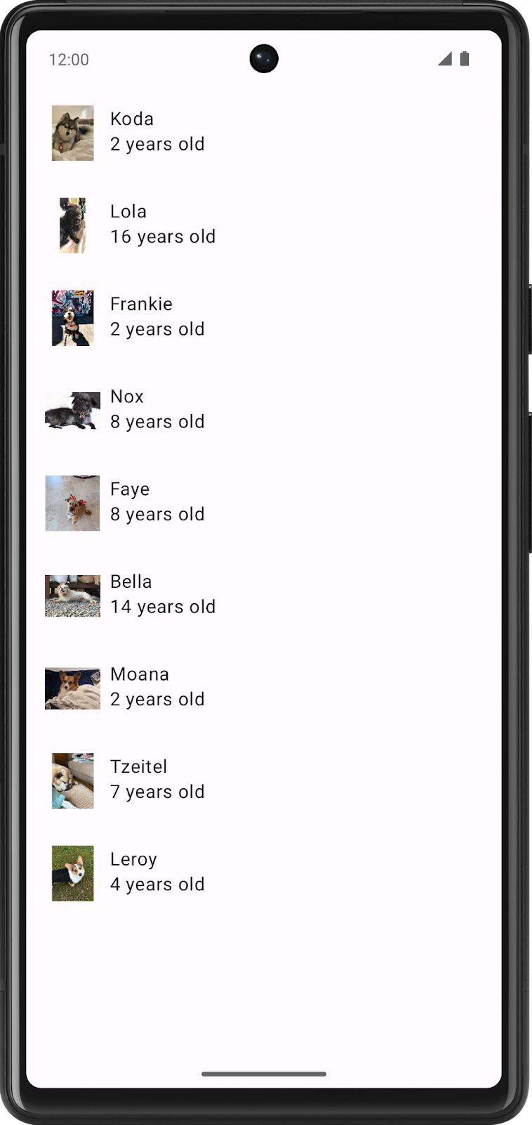
Run the starter code to see what you're starting with; it's a list that displays dogs with their photos, names, and ages. It is functional, but it doesn't look great, so we are going to fix that.
4. Add color
The first thing you are going to modify in the Woof app is the color scheme.
A color scheme is the combination of colors that your app uses. Different color combinations evoke different moods, which influences how people feel when they use your app.
Color, in the Android system, is represented by a hexadecimal (hex) color value. A hex color code starts with a pound (#) character, and is followed by six letters and/or numbers that represent the red, green, and blue (RGB) components of that color. The first two letters/numbers refer to red, the next two refer to green, and the last two refer to blue.

A color can also include an alpha value—letters and/or numbers—which represents the transparency of the color (#00 is 0% opacity (fully transparent), #FF is 100% opacity (fully opaque)). When included, the alpha value is the first two characters of the hex color code after the pound (#) character. If an alpha value is not included, it is assumed to be #FF, which is 100% opacity (fully opaque).
Below are some example colors and their hex values.

Use Material Theme Builder to create a color scheme
To create a custom color scheme for our app, we will use the Material Theme Builder.
- Click this link to go to the Material Theme Builder.
- On the left pane you will see the Core Colors, click on Primary:

- The HCT color picker will open.

- To create the color scheme shown in the app screenshots, you will change the primary color in this color picker. In the text box replace the current text with #006C4C. This will make the primary color of the app green.

Notice how this updates the apps on the screen to adopt a green color scheme.

- Scroll down the page and you will see the full color scheme for light and dark theme generated off of the color you inputted.
You may wonder what all these roles are and how they are utilized, here are a few of the main ones:
- The primary colors are used for key components across the UI.
- The secondary colors are used for less prominent components in the UI.
- The tertiary colors are used for contrasting accents that can be used to balance primary and secondary colors or bring heightened attention to an element, such as an input field.
- The on color elements appear on top of other colors in the palette, and are primarily applied to text, iconography, and strokes. In our color palette, we have an onSurface color, which appears on top of the surface color, and an onPrimary color, which appears on top of the primary color.
Having these slots leads to a cohesive design system, where related components are colored similarly.
Enough theory about colors—time to add this beautiful color palette to the app!
Add color palette to theme
On the Material Theme Builder page, there is the option to click the Export button to download a Color.kt file and Theme.kt file with the custom theme you created in the Theme Builder.
This will work to add the custom theme we create to your app. However, because the generated Theme.kt file does not include the code for dynamic color which we will cover later in the codelab, copy the files in.
- Open the Color.kt file and replace the contents with the code below to copy in the new color scheme.
package com.example.woof.ui.theme

import androidx.compose.ui.graphics.Color

val md_theme_light_primary = Color(0xFF006C4C)
val md_theme_light_onPrimary = Color(0xFFFFFFFF)
val md_theme_light_primaryContainer = Color(0xFF89F8C7)
val md_theme_light_onPrimaryContainer = Color(0xFF002114)
val md_theme_light_secondary = Color(0xFF4D6357)
val md_theme_light_onSecondary = Color(0xFFFFFFFF)
val md_theme_light_secondaryContainer = Color(0xFFCFE9D9)
val md_theme_light_onSecondaryContainer = Color(0xFF092016)
val md_theme_light_tertiary = Color(0xFF3D6373)
val md_theme_light_onTertiary = Color(0xFFFFFFFF)
val md_theme_light_tertiaryContainer = Color(0xFFC1E8FB)
val md_theme_light_onTertiaryContainer = Color(0xFF001F29)
val md_theme_light_error = Color(0xFFBA1A1A)
val md_theme_light_errorContainer = Color(0xFFFFDAD6)
val md_theme_light_onError = Color(0xFFFFFFFF)
val md_theme_light_onErrorContainer = Color(0xFF410002)
val md_theme_light_background = Color(0xFFFBFDF9)
val md_theme_light_onBackground = Color(0xFF191C1A)
val md_theme_light_surface = Color(0xFFFBFDF9)
val md_theme_light_onSurface = Color(0xFF191C1A)
val md_theme_light_surfaceVariant = Color(0xFFDBE5DD)
val md_theme_light_onSurfaceVariant = Color(0xFF404943)
val md_theme_light_outline = Color(0xFF707973)
val md_theme_light_inverseOnSurface = Color(0xFFEFF1ED)
val md_theme_light_inverseSurface = Color(0xFF2E312F)
val md_theme_light_inversePrimary = Color(0xFF6CDBAC)
val md_theme_light_shadow = Color(0xFF000000)
val md_theme_light_surfaceTint = Color(0xFF006C4C)
val md_theme_light_outlineVariant = Color(0xFFBFC9C2)
val md_theme_light_scrim = Color(0xFF000000)

val md_theme_dark_primary = Color(0xFF6CDBAC)
val md_theme_dark_onPrimary = Color(0xFF003826)
val md_theme_dark_primaryContainer = Color(0xFF005138)
val md_theme_dark_onPrimaryContainer = Color(0xFF89F8C7)
val md_theme_dark_secondary = Color(0xFFB3CCBE)
val md_theme_dark_onSecondary = Color(0xFF1F352A)
val md_theme_dark_secondaryContainer = Color(0xFF354B40)
val md_theme_dark_onSecondaryContainer = Color(0xFFCFE9D9)
val md_theme_dark_tertiary = Color(0xFFA5CCDF)
val md_theme_dark_onTertiary = Color(0xFF073543)
val md_theme_dark_tertiaryContainer = Color(0xFF244C5B)
val md_theme_dark_onTertiaryContainer = Color(0xFFC1E8FB)
val md_theme_dark_error = Color(0xFFFFB4AB)
val md_theme_dark_errorContainer = Color(0xFF93000A)
val md_theme_dark_onError = Color(0xFF690005)
val md_theme_dark_onErrorContainer = Color(0xFFFFDAD6)
val md_theme_dark_background = Color(0xFF191C1A)
val md_theme_dark_onBackground = Color(0xFFE1E3DF)
val md_theme_dark_surface = Color(0xFF191C1A)
val md_theme_dark_onSurface = Color(0xFFE1E3DF)
val md_theme_dark_surfaceVariant = Color(0xFF404943)
val md_theme_dark_onSurfaceVariant = Color(0xFFBFC9C2)
val md_theme_dark_outline = Color(0xFF8A938C)
val md_theme_dark_inverseOnSurface = Color(0xFF191C1A)
val md_theme_dark_inverseSurface = Color(0xFFE1E3DF)
val md_theme_dark_inversePrimary = Color(0xFF006C4C)
val md_theme_dark_shadow = Color(0xFF000000)
val md_theme_dark_surfaceTint = Color(0xFF6CDBAC)
val md_theme_dark_outlineVariant = Color(0xFF404943)
val md_theme_dark_scrim = Color(0xFF000000)
- Open the Theme.kt file and replace the contents with the code below to add the new colors to the theme.
package com.example.woof.ui.theme

import android.app.Activity
import android.os.Build
import android.view.View
import androidx.compose.foundation.isSystemInDarkTheme
import androidx.compose.material3.MaterialTheme
import androidx.compose.material3.darkColorScheme
import androidx.compose.material3.dynamicDarkColorScheme
import androidx.compose.material3.dynamicLightColorScheme
import androidx.compose.material3.lightColorScheme
import androidx.compose.runtime.Composable
import androidx.compose.runtime.SideEffect
import androidx.compose.ui.graphics.Color
import androidx.compose.ui.graphics.toArgb
import androidx.compose.ui.platform.LocalContext
import androidx.compose.ui.platform.LocalView
import androidx.core.view.WindowCompat

private val LightColors = lightColorScheme(
    primary = md_theme_light_primary,
    onPrimary = md_theme_light_onPrimary,
    primaryContainer = md_theme_light_primaryContainer,
    onPrimaryContainer = md_theme_light_onPrimaryContainer,
    secondary = md_theme_light_secondary,
    onSecondary = md_theme_light_onSecondary,
    secondaryContainer = md_theme_light_secondaryContainer,
    onSecondaryContainer = md_theme_light_onSecondaryContainer,
    tertiary = md_theme_light_tertiary,
    onTertiary = md_theme_light_onTertiary,
    tertiaryContainer = md_theme_light_tertiaryContainer,
    onTertiaryContainer = md_theme_light_onTertiaryContainer,
    error = md_theme_light_error,
    errorContainer = md_theme_light_errorContainer,
    onError = md_theme_light_onError,
    onErrorContainer = md_theme_light_onErrorContainer,
    background = md_theme_light_background,
    onBackground = md_theme_light_onBackground,
    surface = md_theme_light_surface,
    onSurface = md_theme_light_onSurface,
    surfaceVariant = md_theme_light_surfaceVariant,
    onSurfaceVariant = md_theme_light_onSurfaceVariant,
    outline = md_theme_light_outline,
    inverseOnSurface = md_theme_light_inverseOnSurface,
    inverseSurface = md_theme_light_inverseSurface,
    inversePrimary = md_theme_light_inversePrimary,
    surfaceTint = md_theme_light_surfaceTint,
    outlineVariant = md_theme_light_outlineVariant,
    scrim = md_theme_light_scrim,
)


private val DarkColors = darkColorScheme(
    primary = md_theme_dark_primary,
    onPrimary = md_theme_dark_onPrimary,
    primaryContainer = md_theme_dark_primaryContainer,
    onPrimaryContainer = md_theme_dark_onPrimaryContainer,
    secondary = md_theme_dark_secondary,
    onSecondary = md_theme_dark_onSecondary,
    secondaryContainer = md_theme_dark_secondaryContainer,
    onSecondaryContainer = md_theme_dark_onSecondaryContainer,
    tertiary = md_theme_dark_tertiary,
    onTertiary = md_theme_dark_onTertiary,
    tertiaryContainer = md_theme_dark_tertiaryContainer,
    onTertiaryContainer = md_theme_dark_onTertiaryContainer,
    error = md_theme_dark_error,
    errorContainer = md_theme_dark_errorContainer,
    onError = md_theme_dark_onError,
    onErrorContainer = md_theme_dark_onErrorContainer,
    background = md_theme_dark_background,
    onBackground = md_theme_dark_onBackground,
    surface = md_theme_dark_surface,
    onSurface = md_theme_dark_onSurface,
    surfaceVariant = md_theme_dark_surfaceVariant,
    onSurfaceVariant = md_theme_dark_onSurfaceVariant,
    outline = md_theme_dark_outline,
    inverseOnSurface = md_theme_dark_inverseOnSurface,
    inverseSurface = md_theme_dark_inverseSurface,
    inversePrimary = md_theme_dark_inversePrimary,
    surfaceTint = md_theme_dark_surfaceTint,
    outlineVariant = md_theme_dark_outlineVariant,
    scrim = md_theme_dark_scrim,
)

@Composable
fun WoofTheme(
    darkTheme: Boolean = isSystemInDarkTheme(),
    // Dynamic color is available on Android 12+
    dynamicColor: Boolean = false,
    content: @Composable () -> Unit
) {
    val colorScheme = when {
        dynamicColor && Build.VERSION.SDK_INT >= Build.VERSION_CODES.S -> {
            val context = LocalContext.current
            if (darkTheme) dynamicDarkColorScheme(context) else dynamicLightColorScheme(context)
        }

        darkTheme -> DarkColors
        else -> LightColors
    }
    val view = LocalView.current
    if (!view.isInEditMode) {
        SideEffect {
            setUpEdgeToEdge(view, darkTheme)
        }
    }

    MaterialTheme(
        colorScheme = colorScheme,
        shapes = Shapes,
        typography = Typography,
        content = content
    )
}

/**
 * Sets up edge-to-edge for the window of this [view]. The system icon colors are set to either
 * light or dark depending on whether the [darkTheme] is enabled or not.
 */
private fun setUpEdgeToEdge(view: View, darkTheme: Boolean) {
    val window = (view.context as Activity).window
    WindowCompat.setDecorFitsSystemWindows(window, false)
    window.statusBarColor = Color.Transparent.toArgb()
    val navigationBarColor = when {
        Build.VERSION.SDK_INT >= 29 -> Color.Transparent.toArgb()
        Build.VERSION.SDK_INT >= 26 -> Color(0xFF, 0xFF, 0xFF, 0x63).toArgb()
        // Min sdk version for this app is 24, this block is for SDK versions 24 and 25
        else -> Color(0x00, 0x00, 0x00, 0x50).toArgb()
    }
    window.navigationBarColor = navigationBarColor
    val controller = WindowCompat.getInsetsController(window, view)
    controller.isAppearanceLightStatusBars = !darkTheme
    controller.isAppearanceLightNavigationBars = !darkTheme
}
In WoofTheme() the colorScheme val uses a when statement
- If
dynamicColoris true and the build version is S or higher, it checks if the device is indarkThemeor not. - If it is in dark theme,
colorSchemewill be set todynamicDarkColorScheme. - If it is not in dark theme, it will be set to
dynamicLightColorScheme. - If the app is not using
dynamicColorScheme, it checks if your app is indarkTheme. If so thencolorSchemewill be set toDarkColors. - If neither of those are true then
colorSchemewill be set toLightColors.
The copied in Theme.kt file has dynamicColor set to false and the devices we are working with are in light mode so the colorScheme will be set to LightColors.
val colorScheme = when {
       dynamicColor && Build.VERSION.SDK_INT >= Build.VERSION_CODES.S -> {
           val context = LocalContext.current
           if (darkTheme) dynamicDarkColorScheme(context) else dynamicLightColorScheme(context)
       }

       darkTheme -> DarkColors
       else -> LightColors
   }
- Re-run your app, notice that the app bar has automatically changed color.
Color mapping
Material components are automatically mapped to color slots. Other key components across the UI like Floating Action Buttons also default to the Primary color. This means that you don't need to explicitly assign a color to a component; it is automatically mapped to a color slot when you set the color theme in your app. You can override this by explicitly setting a color in the code. Read more about color roles here.
In this section we will wrap the Row that contains the DogIcon() and DogInformation() with a Card to differentiate the list item colors with the background.
- In
DogItem()composable function, wrap theRow()with aCard().
Card() {
   Row(
       modifier = modifier
           .fillMaxWidth()
           .padding(dimensionResource(id = R.dimen.padding_small))
   ) {
       DogIcon(dog.imageResourceId)
       DogInformation(dog.name, dog.age)
   }
}
- Since
Cardis now the first child composable inDogItem(), pass in the modifier fromDogItem()to theCard, and update theRow's modifier to a new instance ofModifier.
Card(modifier = modifier) {
   Row(
       modifier = Modifier
           .fillMaxWidth()
           .padding(dimensionResource(id = R.dimen.padding_small))
   ) {
       DogIcon(dog.imageResourceId)
       DogInformation(dog.name, dog.age)
   }
}
- Take a look at
WoofPreview(). The list items have now automatically changed color because of theCardComposables. The colors look great, but there is no spacing between the list items.

Dimens file
Just like you use the strings.xml to store the strings in your app, it is also a good practice to use a file called dimens.xml to store dimension values. This is helpful so you don't hard code values and so if you need to, you can change them in a single place.
Go to app > res > values > dimens.xml and take a look at the file. It stores dimension values for padding_small, padding_medium, and image_size. These dimensions will be used throughout the app.
<resources>
   <dimen name="padding_small">8dp</dimen>
   <dimen name="padding_medium">16dp</dimen>
   <dimen name="image_size">64dp</dimen>
</resources>
To add a value from the dimens.xml file, this the correct format:

For example, to add padding_small, you would pass in dimensionResource(id = R.dimen.padding_small).
- In
WoofApp(), add amodifierwithpadding_smallin the call toDogItem().
@Composable
fun WoofApp() {
    Scaffold { it ->
        LazyColumn(contentPadding